Frontend Design for CS Nexus
Jan 5, 2026 - ⧖ 3.0 minBack in 2022 I had a fun idea to build a website containing articles for computer science and programming topics. It was meant to have an easily searchable database and a user-friendly UI. However, I was never able to commit to making it fully realized. Fast-forward to 2026 and LLMs are the new search engines, so this project won't be going anywhere.
However, the frontend is something I spent a while on and I wanted to share it. It's definitely has a "programmer art is still art" vibe, but I like it!
Homepage
The homepage features major topics, a search box, the latest updates, and most popular articles:
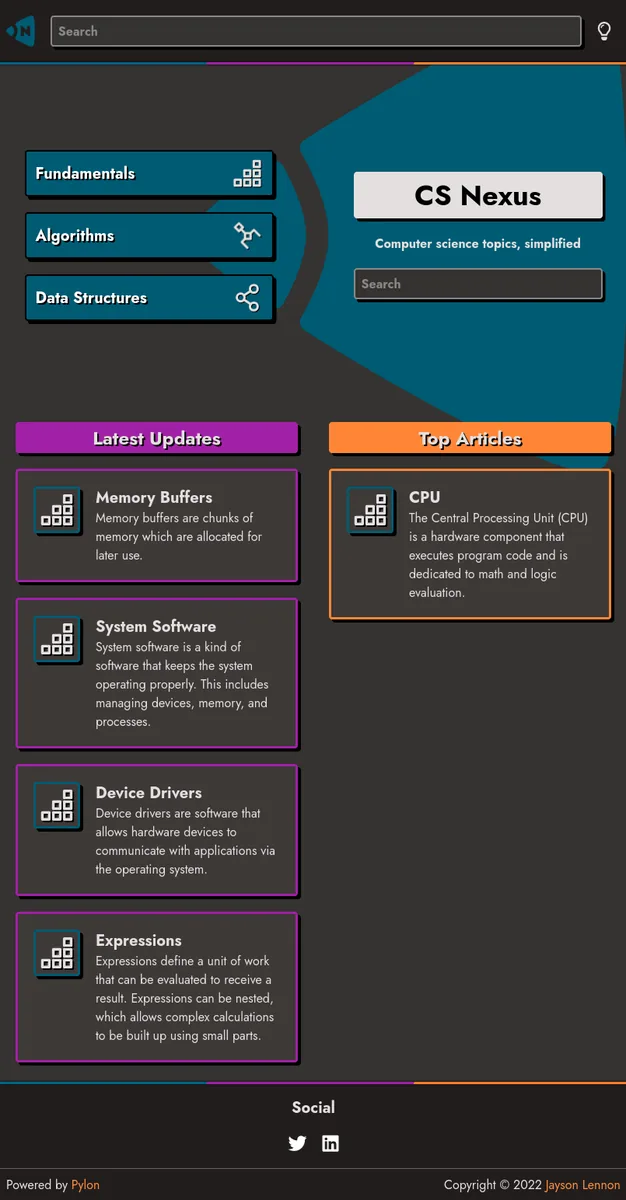
I went with 4 colors for the site: blue, orange, purple, and gray. Almost all elements on the site use one of those colors, or a lighter/darker variant. These are enough colors to cover the majority of elements.
I also used hard shadows on some elements to make them appear to pop off the page. This adds a little bit of depth and focuses attention to those elements.
Topic
A "topic" page contains links to multiple articles, categorized by subtopic:
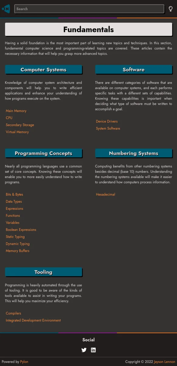
Subtopics are organized into two columns with a description for each, followed by the links to individual articles.
While this design isn't the best for information discovery, it works and is organized. An improvement on this would be to make the subtopic headers collapsible (and collapsed by default). This way they could be quickly scanned and then the user would be able to expand the topic they are interested in.
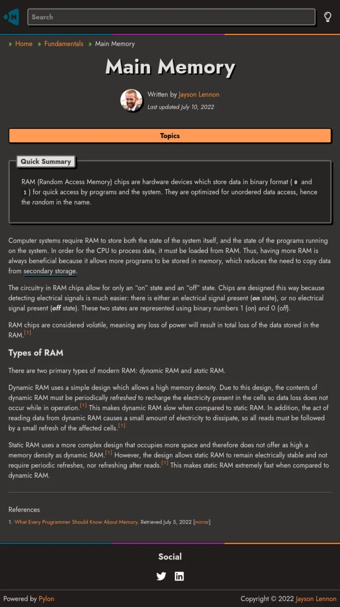
Page
Each page follows this flow:
- Title
- Author
- Quick summary
- Content
The mobile view has a "Topics" button which opens up the list of all articles for the current topic. This enables easy navigation on mobile.
Footnotes are also supported. The idea being that articles would have relevant references so users could read more in-depth about the topic.
In the wide view, the "Topics" button is replaced by a sidebar:
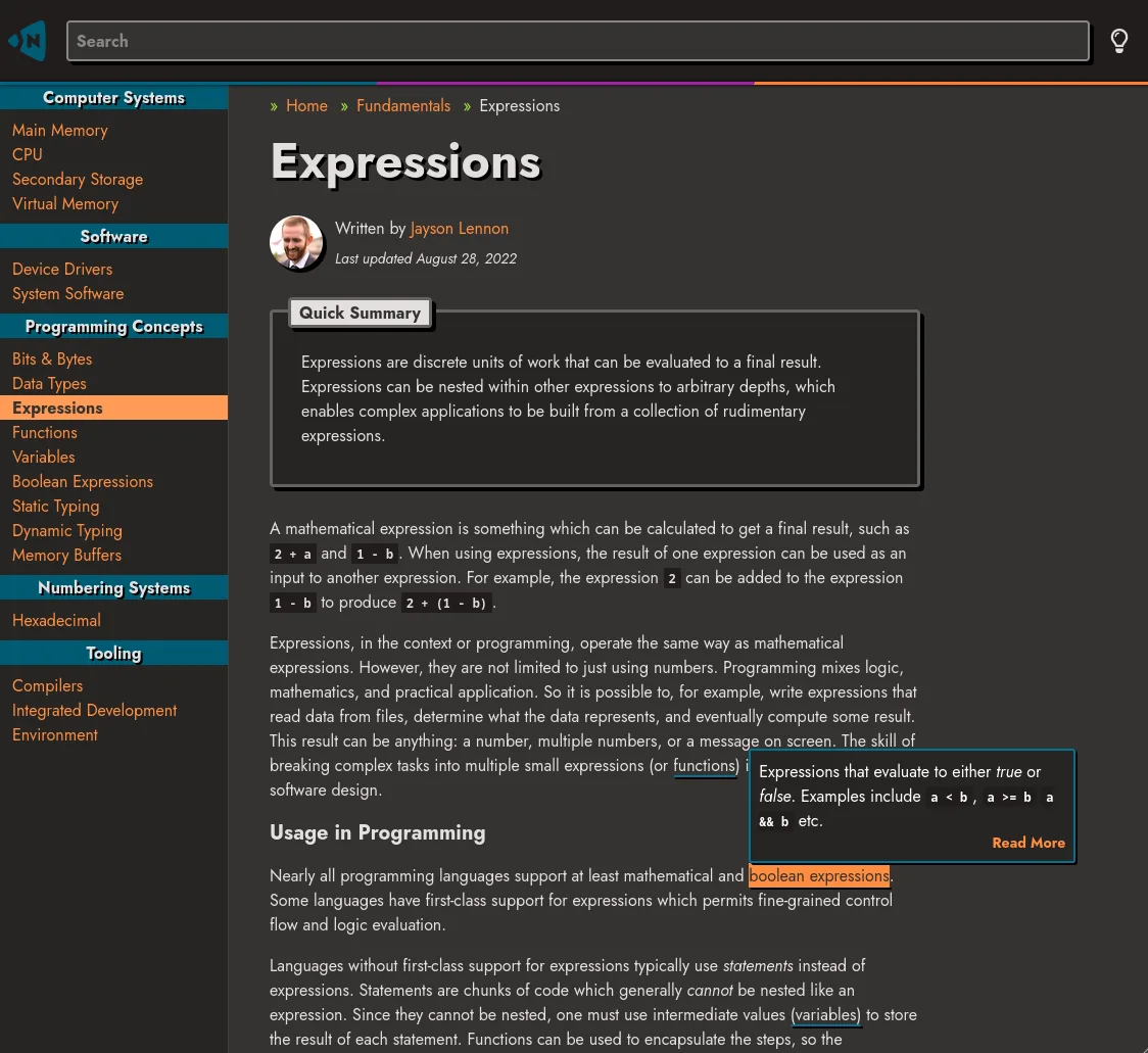
There is also mouseover (or on-tap for mobile) popup content for terms that have a blue underline, as seen in the above screenshot. This makes it easy to get a quick overview of select terms.
The data for these terms are defined on their respective pages. Any update to the original page will be reflected correctly on all pages that link to it. Clicking on the "Read More" link will go to the page on the topic.
Misc
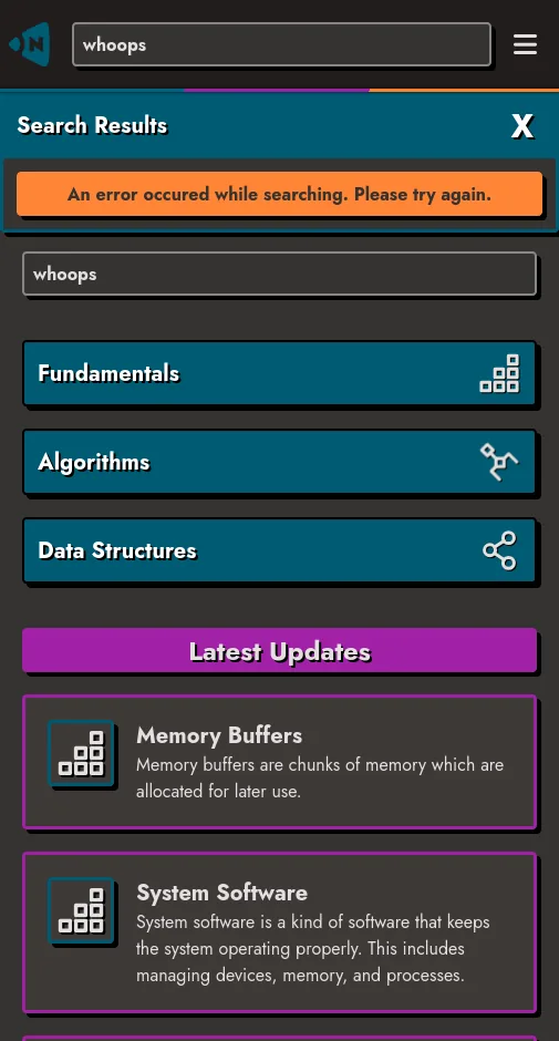
The search box is backed by Meilisearch, but I don't have an instance running at the moment. So all I can show is this generic error message:
There's all there is to the frontend of the site. It doesn't have too many templates because I wanted to keep it simple so it would be easy to work on. It's just markdown files all the way down. If you want to read about the custom static-site generator I wrote to build the site, check out my article on Pylon.